-

- Quick Start
- Existed Sliders
- New Slider
- Slider Types
- Slider Width
- Slider Height
- Image / Hero
- Slides Animation
- Slides Duration
- Slides Interval
- Slides Timing Function
- Sticky Slider
- Pause On Hover
- Autoplay
- Slides Cycle
- Mousewheel Control
- Keyboard Control
- Preloader
- Cursor
- Links VS Drag
- Thumbnails / Indicators
- Animating Elements
- Multiple Slides
- Videos
- Fraction Pagination
- Loading Bar
- Loading Indicators
- Thumbnails Navigation
- Parallax Background
- Scroll Down Button
- Touch Functions
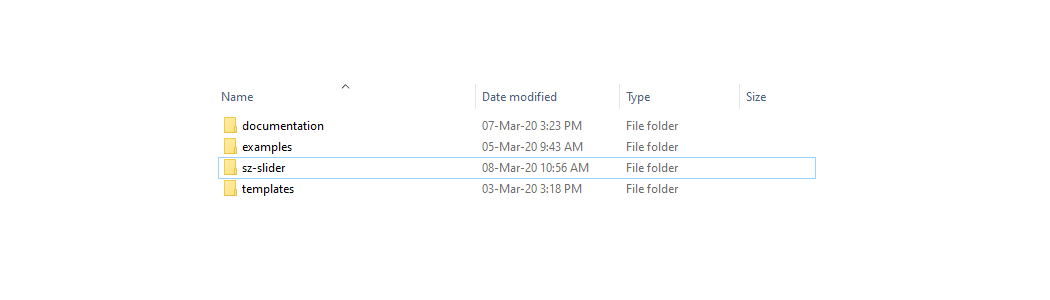
Downloaded Files And Folders
We are assuming you are already using Bootstrap js & css files, as well as jquery file in your project.
But if you are not using aforementioned files then please follow the guideline from Bootstrap's official website by clicking the following link.
1 - After downloading item from CodeCanyon you will find sz-slider folder in main zip file.

2 - Upload sz-slider folder on your website server, theme or App folders.
Include Files To Website Or App
After uploading sz-slider folder, you would have to include CSS and JS files to the website or app. You need to place all the files at the end of previously added css and js files.
<!DOCTYPE html>
lang="en"
...
href="your/path/to/sz-slider/css/sz-slider.css" rel="stylesheet"
...
src="your/path/to/sz-slider/js/sz-slider.js"
Existed Bootstrap Version 4 - Carousel
If you are already using Bootstrap 4 Carousel in your projects then there is no need to re-write HTML mark-up. Just follow the following guideline:
- 1 - Include CSS and JS files as we have already mentioned in above section (sz-slider.css & sz-slider.js).
- 2 - Add "sz-slider" class in the main carousel wrapper.
- 3 - Add data-height="auto" attribute in the main carousel wrapper. Remember that if you already set the height of carousel in your own CSS file then data-height attribute is not essential.
- 4 - Please delete the following attributes and classes from the carousel.
- i - Delete slide class from main carousel wrapper.
- ii - Delete all default attributes of carousel like "data-ride="carousel", data-interval="false" etc." from main carousel wrapper also.
- iii - Delete data-slide-to="" attributes from all carousel indicators.
- iv - Delete data-slide="prev" & data-slide="next" attributes from navigation left and right buttons.
<!--
After making above changes Carousel will look like the following
-->
<!-- Slider Wrapper -->
id="mySliderId" class="carousel sz-slider" data-height="auto"
<!-- indicators -->
class="carousel-indicators"
data-target="#mySliderId" class="active"
data-target="#mySliderId"
data-target="#mySliderId"
<!-- Slides Wrapper -->
class="carousel-inner"
<!-- Slide 1 -->
class="carousel-item active"
<!-- Slide 2 -->
class="carousel-item"
<!-- Slide 3 -->
class="carousel-item"
<!-- Left Button -->
href="#mySliderId" class="carousel-control-btn carousel-control-prev"
class="carousel-control-prev-icon"
<!-- Right Button -->
href="#mySliderId" class="carousel-control-btn carousel-control-next"
class="carousel-control-next-icon"
Existed Bootstrap Version 3.x.x - Carousel
If you are already using Bootstrap 3 Carousel in your projects then there is no need to re-write HTML mark-up. Just follow the following guideline:
- 1 - Include CSS and JS files as we have already mentioned in above section (sz-slider.css & sz-slider.js).
- 2 - Add "sz-slider" class in the main carousel wrapper.
- 3 - Add data-height="auto" attribute in the main carousel wrapper. Remember that if you already set the height of carousel in your own CSS file then data-height attribute is not essential.
- 4 - Please delete the following attributes and classes from the carousel.
- i - Delete slide class from main carousel wrapper.
- ii - Delete all default attributes of carousel like "data-ride="carousel", data-interval="false" etc." from main carousel wrapper also.
- iii - Delete data-slide-to="" attributes from all carousel indicators.
- iv - Delete data-slide="prev" & data-slide="next" attributes from navigation left and right buttons.
<!--
After making above changes Carousel will look like the following
-->
<!-- Slider Wrapper -->
id="mySliderId" class="carousel sz-slider" data-height="auto"
<!-- indicators -->
class="carousel-indicators"
data-target="#mySliderId" class="active"
data-target="#mySliderId"
data-target="#mySliderId"
<!-- Slides Wrapper -->
class="carousel-inner"
<!-- Slide 1 -->
class="item active"
<!-- Slide 2 -->
class="item"
<!-- Slide 3 -->
class="item"
<!-- Left Button -->
href="#mySliderId" class="left carousel-control"
class="glyphicon glyphicon-chevron-left"
<!-- Right Button -->
href="#mySliderId" class="right carousel-control"
class="glyphicon glyphicon-chevron-right"
Bootstrap Version 4 - Basic HTML
After including CSS and JS files as we have already mentioned in above section. Use the following HTML mark-up in your project for basic slider.
<!-- Slider Wrapper -->
id="mySliderId" class="carousel sz-slider" data-width="100%" data-height="auto"
<!-- If we need indicators -->
class="carousel-indicators"
data-target="#mySliderId" class="active"
data-target="#mySliderId"
data-target="#mySliderId"
<!-- Slides Wrapper -->
class="carousel-inner"
<!-- Slide 1 -->
class="carousel-item active"
<!-- If we need background image -->
src="your/image/url/01.png" alt="image 01" class="sz-bg-img"
<!-- All other elements will go here -->
Slide 1 data like image, text etc.
<!-- Slide 2 -->
class="carousel-item"
<!-- If we need background image -->
src="your/image/url/02.png" alt="image 02" class="sz-bg-img"
<!-- All other elements will go here -->
Slide 2 data like image, text etc.
<!-- Slide 3 -->
class="carousel-item"
<!-- If we need background image -->
src="your/image/url/03.png" alt="image 03" class="sz-bg-img"
<!-- All other elements will go here -->
Slide 3 data like image, text etc.
<!-- Left Button -->
href="#mySliderId" class="carousel-control-btn carousel-control-prev"
class="carousel-control-prev-icon"
<!-- Right Button -->
href="#mySliderId" class="carousel-control-btn carousel-control-next"
class="carousel-control-next-icon"
<!-- If we need pagination -->
class="carousel-item-number"
<!-- Number Of Current Slide -->
class="carousel-item-single"
<!-- Divider -->
/
<!-- Total Numbers Of Slides -->
class="carousel-item-length"
Bootstrap Version 3 - Basic HTML
<!-- Slider Wrapper -->
id="mySliderId" class="carousel sz-slider" data-width="100%" data-height="auto"
<!-- If we need indicators -->
class="carousel-indicators"
data-target="#mySliderId" class="active"
data-target="#mySliderId"
data-target="#mySliderId"
<!-- Slides Wrapper -->
class="carousel-inner"
<!-- Slide 1 -->
class="item active"
<!-- If we need background image -->
src="your/image/url/01.png" alt="image 01" class="sz-bg-img"
<!-- All other elements will go here -->
Slide 1 data like image, text etc.
<!-- Slide 2 -->
class="item"
<!-- If we need background image -->
src="your/image/url/02.png" alt="image 02" class="sz-bg-img"
<!-- All other elements will go here -->
Slide 2 data like image, text etc.
<!-- Slide 3 -->
class="item"
<!-- If we need background image -->
src="your/image/url/03.png" alt="image 03" class="sz-bg-img"
<!-- All other elements will go here -->
Slide 3 data like image, text etc.
<!-- Left Button -->
href="#mySliderId" class="left carousel-control"
class="glyphicon glyphicon-chevron-left"
<!-- Right Button -->
href="#mySliderId" class="right carousel-control"
class="glyphicon glyphicon-chevron-right"
<!-- If we need pagination -->
class="carousel-item-number"
<!-- Number Of Current Slide -->
class="carousel-item-single"
<!-- Divider -->
/
<!-- Total Numbers Of Slides -->
class="carousel-item-length"
Slider Types
Use data-type attribute to select slider type. Default value is : slider
1 - Single Item Slider
<!-- For Single Item -->
id="mySliderId" class="carousel sz-slider" data-type="slider"
2 - Multiple Items Slider
<!-- For Multiple Items -->
id="mySliderId" class="carousel sz-slider" data-type="carousel"
Slider Width
Use data-width attribute for slider width size. You can assign a value in length units like px, %, rem, vw etc. Default value is : 100%
1 - Set slider width by using data-width attribute
<!-- Using data-width -->
id="mySliderId" class="carousel sz-slider" data-width="100%"
2 - Set slider width by using your own CSS file.
<!-- If you want to use this method then delete data-width attribute -->
#mySliderId.carousel
width: 100%;
Slider Height
Use data-height attribute for slider height size. You can assign a value in length units like px, %, rem, vh etc. Default value is : inherit
1 - Set slider height by using data-height attribute in units
<!-- Using data-height -->
id="mySliderId" class="carousel sz-slider" data-height="500px"
2 - Set slider height according to window's height.
<!-- Assign "window" value to data-height attribute -->
id="mySliderId" class="carousel sz-slider" data-height="window"
3 - Set slider height according to images height (Auto Height). This attribute does not works in vertical sliders.
<!-- Assign "auto" value to data-height attribute -->
id="mySliderId" class="carousel sz-slider" data-height="auto"
4 - Set slider height by using your own CSS file.
<!-- If you want to use this method then delete data-height attribute
Also use !important to replace the default values -->
#mySliderId.carousel
height: 100% !important;
Image / Hero
Use data-background attribute to make an image slider or a hero slider. Default value is : hero
Also Use data-image attribute for images size. Default value is : cover
1 - Image Slider
<!-- Assign "image" value to data-background attribute -->
id="mySliderId" class="carousel sz-slider" data-background="image"
<!--
1st value is image width.
Add a white space then add 2nd value
2nd value is image height.
You can assign a value in length units like px, %, rem, vw, vh etc.
-->
id="mySliderId" class="carousel sz-slider" data-background="image" data-image="250px 300px"
2 - Hero Slider : This will use background-image css property to set background images.
<!-- Assign "hero" value to data-background attribute -->
id="mySliderId" class="carousel sz-slider" data-background="hero"
<!--
1st value is image width.
Add a white space then add 2nd value
2nd value is image height.
You can also use all background-size properties like auto, cover, contain, length or percentage.
-->
id="mySliderId" class="carousel sz-slider" data-background="hero" data-image="cover"
3 - Changing hero slider images other CSS properties like origin, position, repeat, attachment etc. by using your own CSS file.
<!-- Use !important to replace the default values -->
#mySliderId.carousel > .carousel-inner > .carousel-item
background-position: center !important;
background-repeat: no-repeat !important;
background-attachment: scroll !important;
background-origin: padding-box !important;
Slides Animation
Use data-animation attribute for slides animation effects. Default value is : dragX
Drag slides left or right
<!-- Assign "dragX" value to data-animation attribute -->
id="mySliderId" class="carousel sz-slider" data-animation="dragX"
Drag slides up or down
<!-- Assign "dragY" value to data-animation attribute -->
id="mySliderId" class="carousel sz-slider" data-animation="dragY"
Swipe slides left or right.
<!-- Assign "swipeX" value to data-animation attribute -->
id="mySliderId" class="carousel sz-slider" data-animation="swipeX"
Swipe slides up or down.
<!-- Assign "swipeY" value to data-animation attribute -->
id="mySliderId" class="carousel sz-slider" data-animation="swipeY"
Swipe slides left or right. It will animate slides with a fade transition instead of a slide. This feature is available only in single item slider and not available in multiple items sliders.
<!-- Assign "fade" value to data-animation attribute -->
id="mySliderId" class="carousel sz-slider" data-animation="fade"
Default value in data-animation attribute will disabled touch swipe or drag functions completely.
<!-- Assign "default" value to data-animation attribute -->
id="mySliderId" class="carousel sz-slider" data-animation="default"
This feature is available only in single item sliders and not available in multiple items sliders.
Drag slides left or right, it will centred the slides horizontally.
<!--
1 - Assign "dragCoverX" value to "data-animation" attribute
2 - Assign numeric value to "data-space" attribute
-->
id="mySliderId" class="carousel sz-slider" data-animation="dragCoverX" data-space="1.7"
Space Between Slides
Use data-space attribute to increase or decrease the area of left, right Or Up, down slides to show. This attribute accept a number only. Default value is : 1.35
<!-- Assign value to data-space attribute -->
id="mySliderId" class="carousel sz-slider" data-animation="dragCoverX" data-space="1.7"
If you want to create padding or space between slides then follow the instructions:
1 - Changing in html slides mark-up.
<!-- Slides Wrapper -->
class="carousel-inner"
<!-- Slide 1 -->
class="carousel-item active"
<!-- Create a child wrapper also -->
class="sz-wrapper"
Slide 1 data like image, text etc.
<!-- Slide 2 -->
class="carousel-item"
<!-- Create a child wrapper also -->
class="sz-wrapper"
Slide 2 data like image, text etc.
<!-- Slide 3 -->
class="carousel-item"
<!-- Create a child wrapper also -->
class="sz-wrapper"
Slide 3 data like image, text etc.
2 - Adding CSS for new child wrapper.
<!-- You can use value according to your requirements -->
#mySliderId.carousel > .carousel-inner > .carousel-item > .sz-wrapper
padding: 20px 20px;
This feature is available only in single item sliders and not available in multiple items sliders.
Drag slides up or down, it will centred the slides vertically.
<!--
1 - Assign "dragCoverY" value to "data-animation" attribute
2 - Assign numeric value to "data-space" attribute
-->
id="mySliderId" class="carousel sz-slider" data-animation="dragCoverY" data-space="1.7"
Space Between Slides
Use data-space attribute to increase or decrease the area of left, right Or Up, down slides to show. This attribute accept a number only. Default value is : 1.35
<!-- Assign value to data-space attribute -->
id="mySliderId" class="carousel sz-slider" data-animation="dragCoverY" data-space="1.7"
If you want to create padding or space between slides then follow the instructions:
1 - Changing in html slides mark-up.
<!-- Slides Wrapper -->
class="carousel-inner"
<!-- Slide 1 -->
class="carousel-item active"
<!-- Create a child wrapper also -->
class="sz-wrapper"
Slide 1 data like image, text etc.
<!-- Slide 2 -->
class="carousel-item"
<!-- Create a child wrapper also -->
class="sz-wrapper"
Slide 2 data like image, text etc.
<!-- Slide 3 -->
class="carousel-item"
<!-- Create a child wrapper also -->
class="sz-wrapper"
Slide 3 data like image, text etc.
2 - Adding CSS for new child wrapper.
<!-- You can use value according to your requirements -->
#mySliderId.carousel > .carousel-inner > .carousel-item > .sz-wrapper
padding: 20px 20px;
This feature is available only in single item sliders and not available in multiple items sliders.
Swipe slides left or right, it will centred the slides horizontally.
<!--
1 - Assign "swipeCoverX" value to "data-animation" attribute
2 - Assign numeric value to "data-space" attribute
-->
id="mySliderId" class="carousel sz-slider" data-animation="swipeCoverX" data-space="1.7"
Space Between Slides
Use data-space attribute to increase or decrease the area of left, right Or Up, down slides to show. This attribute accept a number only. Default value is : 1.35
<!-- Assign value to data-space attribute -->
id="mySliderId" class="carousel sz-slider" data-animation="swipeCoverX" data-space="1.7"
If you want to create padding or space between slides then follow the instructions:
1 - Changing in html slides mark-up.
<!-- Slides Wrapper -->
class="carousel-inner"
<!-- Slide 1 -->
class="carousel-item active"
<!-- Create a child wrapper also -->
class="sz-wrapper"
Slide 1 data like image, text etc.
<!-- Slide 2 -->
class="carousel-item"
<!-- Create a child wrapper also -->
class="sz-wrapper"
Slide 2 data like image, text etc.
<!-- Slide 3 -->
class="carousel-item"
<!-- Create a child wrapper also -->
class="sz-wrapper"
Slide 3 data like image, text etc.
2 - Adding CSS for new child wrapper.
<!-- You can use value according to your requirements -->
#mySliderId.carousel > .carousel-inner > .carousel-item > .sz-wrapper
padding: 20px 20px;
This feature is available only in single item sliders and not available in multiple items sliders.
Swipe slides up or down, it will centred the slides vertically.
<!--
1 - Assign "swipeCoverY" value to "data-animation" attribute
2 - Assign numeric value to "data-space" attribute
-->
id="mySliderId" class="carousel sz-slider" data-animation="swipeCoverY" data-space="1.7"
Space Between Slides
Use data-space attribute to increase or decrease the area of left, right Or Up, down slides to show. This attribute accept a number only. Default value is : 1.35
<!-- Assign value to data-space attribute -->
id="mySliderId" class="carousel sz-slider" data-animation="swipeCoverY" data-space="1.7"
If you want to create padding or space between slides then follow the instructions:
1 - Changing in html slides mark-up.
<!-- Slides Wrapper -->
class="carousel-inner"
<!-- Slide 1 -->
class="carousel-item active"
<!-- Create a child wrapper also -->
class="sz-wrapper"
Slide 1 data like image, text etc.
<!-- Slide 2 -->
class="carousel-item"
<!-- Create a child wrapper also -->
class="sz-wrapper"
Slide 2 data like image, text etc.
<!-- Slide 3 -->
class="carousel-item"
<!-- Create a child wrapper also -->
class="sz-wrapper"
Slide 3 data like image, text etc.
2 - Adding CSS for new child wrapper.
<!-- You can use value according to your requirements -->
#mySliderId.carousel > .carousel-inner > .carousel-item > .sz-wrapper
padding: 20px 20px;
This feature is available only in single item sliders and not available in multiple items sliders.
Drag slides left or right, it will create cover flow of slides horizontally.
You can also increase or decrease partial view of slides by using data-space attribute. It receive a number without any unit.
Default value is : 1.35
You can also set minimum or maximum scale values by using data-cover-min and data-cover-max attributes. These attributes receive numeric values without any unit.
Default values are : 0.875 and 1 respectively.
<!--
1 - Assign "dragCover2X" value to "data-animation" attribute
2 - Assign numeric value to "data-space" attribute
3 - Assign numeric value to "data-cover-min" attribute for minimum scale
4 - Assign numeric value to "data-cover-max" attribute for maximum scale
-->
id="mySliderId" class="carousel sz-slider" data-animation="dragCover2X" data-space="1.7" data-cover-min="0.5" data-cover-max="1.2"
This feature is available only in single item sliders and not available in multiple items sliders.
Drag slides up or down, it will create cover flow of slides vertically.
You can also increase or decrease partial view of slides by using data-space attribute. It receive a number without any unit.
Default value is : 1.35
You can also set minimum or maximum scale values by using data-cover-min and data-cover-max attributes. These attributes receive numeric values without any unit.
Default values are : 0.875 and 1 respectively.
<!--
1 - Assign "dragCover2Y" value to "data-animation" attribute
2 - Assign numeric value to "data-space" attribute
3 - Assign numeric value to "data-cover-min" attribute for minimum scale
4 - Assign numeric value to "data-cover-max" attribute for maximum scale
-->
id="mySliderId" class="carousel sz-slider" data-animation="dragCover2Y" data-space="2" data-cover-min="0.7" data-cover-max="1"
This feature is available only in single item sliders and not available in multiple items sliders.
Swipe slides left or right, it will create cover flow of slides horizontally.
You can also increase or decrease partial view of slides by using data-space attribute. It receive a number without any unit.
Default value is : 1.35
You can also set minimum or maximum scale values by using data-cover-min and data-cover-max attributes. These attributes receive numeric values without any unit.
Default values are : 0.875 and 1 respectively.
<!--
1 - Assign "swipeCover2X" value to "data-animation" attribute
2 - Assign numeric value to "data-space" attribute
3 - Assign numeric value to "data-cover-min" attribute for minimum scale
4 - Assign numeric value to "data-cover-max" attribute for maximum scale
-->
id="mySliderId" class="carousel sz-slider" data-animation="swipeCover2X" data-space="1.7" data-cover-min="0.5" data-cover-max="1.2"
This feature is available only in single item sliders and not available in multiple items sliders.
Swipe slides up or down, it will create cover flow of slides vertically.
You can also increase or decrease partial view of slides by using data-space attribute. It receive a number without any unit.
Default value is : 1.35
You can also set minimum or maximum scale values by using data-cover-min and data-cover-max attributes. These attributes receive numeric values without any unit.
Default values are : 0.875 and 1 respectively.
<!--
1 - Assign "swipeCover2Y" value to "data-animation" attribute
2 - Assign numeric value to "data-space" attribute
3 - Assign numeric value to "data-cover-min" attribute for minimum scale
4 - Assign numeric value to "data-cover-max" attribute for maximum scale
-->
id="mySliderId" class="carousel sz-slider" data-animation="swipeCover2Y" data-space="1.7" data-cover-min="0.5" data-cover-max="1.2"
This feature is available only in single item sliders and not available in multiple items sliders.
Drag slides left or right, it will create cover flow of slides horizontally.
You can also increase or decrease partial view of slides by using data-space attribute. It receive a number without any unit.
Default value is : 1.35
You can also set minimum or maximum Rotate values by using data-cover-min and data-cover-max attributes. These attributes receive positive numeric values without any unit. These values are degree units.
Default values are : 0.875 and 1 respectively.
<!--
1 - Assign "dragCover3X" value to "data-animation" attribute
2 - Assign numeric value to "data-space" attribute
3 - Assign numeric value to "data-cover-min" attribute for minimum rotate
4 - Assign numeric value to "data-cover-max" attribute for maximum rotate
-->
id="mySliderId" class="carousel sz-slider" data-animation="dragCover3X" data-space="2" data-cover-min="45" data-cover-max="0"
This feature is available only in single item sliders and not available in multiple items sliders.
Drag slides up or down, it will create cover flow of slides vertically.
You can also increase or decrease partial view of slides by using data-space attribute. It receive a number without any unit.
Default value is : 1.35
You can also set minimum or maximum Rotate values by using data-cover-min and data-cover-max attributes. These attributes receive positive numeric values without any unit. These values are degree units.
Default values are : 0.875 and 1 respectively.
<!--
1 - Assign "dragCover3Y" value to "data-animation" attribute
2 - Assign numeric value to "data-space" attribute
3 - Assign numeric value to "data-cover-min" attribute for minimum rotate
4 - Assign numeric value to "data-cover-max" attribute for maximum rotate
-->
id="mySliderId" class="carousel sz-slider" data-animation="dragCover3Y" data-space="2" data-cover-min="45" data-cover-max="0"
This feature is available only in single item sliders and not available in multiple items sliders.
Swipe slides left or right, it will create cover flow of slides horizontally.
You can also increase or decrease partial view of slides by using data-space attribute. It receive a number without any unit.
Default value is : 1.35
You can also set minimum or maximum Rotate values by using data-cover-min and data-cover-max attributes. These attributes receive positive numeric values without any unit. These values are degree units.
Default values are : 0.875 and 1 respectively.
<!--
1 - Assign "swipeCover3X" value to "data-animation" attribute
2 - Assign numeric value to "data-space" attribute
3 - Assign numeric value to "data-cover-min" attribute for minimum rotate
4 - Assign numeric value to "data-cover-max" attribute for maximum rotate
-->
id="mySliderId" class="carousel sz-slider" data-animation="swipeCover3X" data-space="2" data-cover-min="45" data-cover-max="0"
This feature is available only in single item sliders and not available in multiple items sliders.
Swipe slides up or down, it will create cover flow of slides vertically.
You can also increase or decrease partial view of slides by using data-space attribute. It receive a number without any unit.
Default value is : 1.35
You can also set minimum or maximum Rotate values by using data-cover-min and data-cover-max attributes. These attributes receive positive numeric values without any unit. These values are degree units.
Default values are : 0.875 and 1 respectively.
<!--
1 - Assign "swipeCover3Y" value to "data-animation" attribute
2 - Assign numeric value to "data-space" attribute
3 - Assign numeric value to "data-cover-min" attribute for minimum rotate
4 - Assign numeric value to "data-cover-max" attribute for maximum rotate
-->
id="mySliderId" class="carousel sz-slider" data-animation="swipeCover3Y" data-space="2" data-cover-min="45" data-cover-max="0"
This feature is available only in single item sliders and not available in multiple items sliders.
Drag slides left or right, it will create cover flow of slides horizontally.
You can also increase or decrease partial view of slides by using data-space attribute. It receive a number without any unit.
Default value is : 1.35
You can also set minimum or maximum flip values by using data-cover-min and data-cover-max attributes. These attributes receive positive numeric values without any unit. These values are degree units.
Default values are : 0.875 and 1 respectively.
You can also set perspective values by using data-cover-perspective. This attribute receive positive numeric values without any unit.
Default value is : 0.
<!--
1 - Assign "dragCover4X" value to "data-animation" attribute
2 - Assign numeric value to "data-space" attribute
3 - Assign numeric value to "data-cover-min" attribute for minimum flip
4 - Assign numeric value to "data-cover-max" attribute for maximum flip
5 - Assign numeric value to "data-cover-perspective" attribute for perspective
-->
id="mySliderId" class="carousel sz-slider" data-animation="dragCover4X" data-space="2" data-cover-min="45" data-cover-max="0" data-cover-perspective="400"
This feature is available only in single item sliders and not available in multiple items sliders.
Drag slides up or down, it will create cover flow of slides vertically.
You can also increase or decrease partial view of slides by using data-space attribute. It receive a number without any unit.
Default value is : 1.35
You can also set minimum or maximum flip values by using data-cover-min and data-cover-max attributes. These attributes receive positive numeric values without any unit. These values are degree units.
Default values are : 0.875 and 1 respectively.
You can also set perspective values by using data-cover-perspective. This attribute receive positive numeric values without any unit.
Default value is : 0.
<!--
1 - Assign "dragCover4Y" value to "data-animation" attribute
2 - Assign numeric value to "data-space" attribute
3 - Assign numeric value to "data-cover-min" attribute for minimum flip
4 - Assign numeric value to "data-cover-max" attribute for maximum flip
5 - Assign numeric value to "data-cover-perspective" attribute for perspective
-->
id="mySliderId" class="carousel sz-slider" data-animation="dragCover4Y" data-space="2" data-cover-min="45" data-cover-max="0" data-cover-perspective="400"
This feature is available only in single item sliders and not available in multiple items sliders.
Swipe slides left or right, it will create cover flow of slides horizontally.
You can also increase or decrease partial view of slides by using data-space attribute. It receive a number without any unit.
Default value is : 1.35
You can also set minimum or maximum flip values by using data-cover-min and data-cover-max attributes. These attributes receive positive numeric values without any unit. These values are degree units.
Default values are : 0.875 and 1 respectively.
You can also set perspective values by using data-cover-perspective. This attribute receive positive numeric values without any unit.
Default value is : 0.
<!--
1 - Assign "swipeCover4X" value to "data-animation" attribute
2 - Assign numeric value to "data-space" attribute
3 - Assign numeric value to "data-cover-min" attribute for minimum flip
4 - Assign numeric value to "data-cover-max" attribute for maximum flip
5 - Assign numeric value to "data-cover-perspective" attribute for perspective
-->
id="mySliderId" class="carousel sz-slider" data-animation="swipeCover4X" data-space="2" data-cover-min="45" data-cover-max="0" data-cover-perspective="400"
This feature is available only in single item sliders and not available in multiple items sliders.
Swipe slides up or down, it will create cover flow of slides vertically.
You can also increase or decrease partial view of slides by using data-space attribute. It receive a number without any unit.
Default value is : 1.35
You can also set minimum or maximum flip values by using data-cover-min and data-cover-max attributes. These attributes receive positive numeric values without any unit. These values are degree units.
Default values are : 0.875 and 1 respectively.
You can also set perspective values by using data-cover-perspective. This attribute receive positive numeric values without any unit.
Default value is : 0.
<!--
1 - Assign "swipeCover4Y" value to "data-animation" attribute
2 - Assign numeric value to "data-space" attribute
3 - Assign numeric value to "data-cover-min" attribute for minimum flip
4 - Assign numeric value to "data-cover-max" attribute for maximum flip
5 - Assign numeric value to "data-cover-perspective" attribute for perspective
-->
id="mySliderId" class="carousel sz-slider" data-animation="swipeCover4Y" data-space="2" data-cover-min="45" data-cover-max="0" data-cover-perspective="400"
This feature is available only in single item and horizontal sliders.
1 - Add dragCover2X or swipeCover2X value into data-animation attribute.
2 - Set the partial view by increasing or decreasing value into data-space attribute according to your requirements.
3 - Set the minimum scale value into data-cover-min attribute according to your requirements.
4 - Set the maximum scale value into data-cover-max attribute according to your requirements.
<!--
1 - We are using "dragCover2X" value into "data-animation" attribute
2 - We are using "4" value into "data-space" attribute
3 - We are using "0.8" value into "data-cover-min" attribute
4 - We are using "1" value into "data-cover-max" attribute
-->
id="mySliderId" class="carousel sz-slider" data-animation="dragCover2X" data-space="4" data-cover-min="0.8" data-cover-max="1"
This feature is available only in single item and horizontal sliders.
1 - Add dragCover2X or swipeCover2X value into data-animation attribute.
2 - Set the partial view by increasing or decreasing value into data-space attribute according to your requirements.
3 - Set the minimum scale value into data-cover-min attribute according to your requirements.
4 - Set the maximum scale value into data-cover-max attribute according to your requirements.
<!--
1 - We are using "dragCover2X" value into "data-animation" attribute
2 - We are using "4" value into "data-space" attribute
3 - We are using "1" value into "data-cover-min" attribute
4 - We are using "1.2" value into "data-cover-max" attribute
-->
id="mySliderId" class="carousel sz-slider" data-animation="dragCover2X" data-space="4" data-cover-min="1" data-cover-max="1.2"
5 - To create overlapping effect we must write our own CSS.
5 - i - Set fixed height of carousel main wrapper.
<!-- Use !important to replace the default values -->
#mySliderId.carousel
height: 412px !important;
5 - ii - Set the height of items or slides wrapper manually. Also set the value of padding-top until where you found its OK.
<!-- Use !important to replace the default values -->
#mySliderId.carousel > .carousel-inner
height: 100% !important;
padding-top: 35px !important;
5 - iii - Height of items or slides should be less than its wrapper.
<!-- Use !important to replace the default values -->
#mySliderId.carousel > .carousel-inner > .carousel-item
height: 90% !important;
5 - iv - Set the height and width of sz-wrapper.
<!-- Use !important to replace the default values -->
#mySliderId.carousel > .carousel-inner > .carousel-item .sz-wrapper
width: 100% !important;
height: 100% !important;
5 - v - Set the height and width of images or use hero style.
<!-- Use !important to replace the default values -->
#mySliderId.carousel > .carousel-inner > .carousel-item .sz-wrapper > img
width: 100% !important;
height: 100% !important;
This feature is available only in single item and horizontal sliders.
1 - Add "class" as a value into data-animation attribute.
<!--
Adding "class" value into "data-animation" attribute
-->
id="mySliderId" class="carousel sz-slider" data-animation="class"
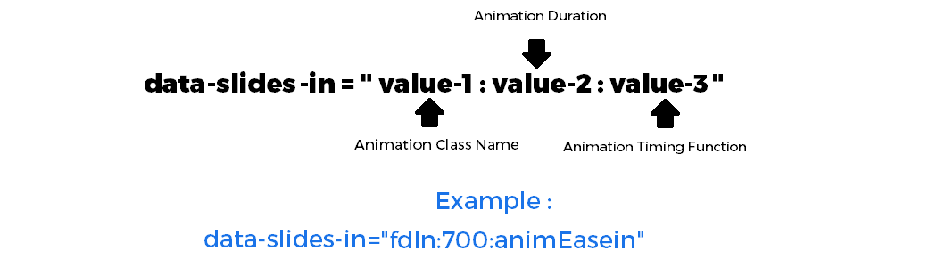
2 - Adding animation to show a slide: Add "data-slides-in" attribute to the slide. It has 3 values separated by colon " : "
1st value of the attribute is animation class name.
2nd value of the attribute is animation duration.
3rd value of the attribute is animation timing function.
<!-- Slides Wrapper -->
class="carousel-inner"
<!-- Slide 1 -->
class="carousel-item active" data-slides-in="fdInTp:2000:animEasein"
src="your/image/url/01.png" alt="image 01" class="sz-bg-img"
<!-- All other elements will go here -->
Slide 1 data like image, text etc.
<!-- End of Slide 1 -->
<!-- Slide 2 -->
class="carousel-item" data-slides-in="sclInXRgt:1000:animEaseout"
src="your/image/url/02.png" alt="image 02" class="sz-bg-img"
<!-- All other elements will go here -->
Slide 2 data like image, text etc.
<!-- End of Slide 2 -->
<!-- Slide 3 -->
class="carousel-item" data-slides-in="sclInCntr:700:animEase"
src="your/image/url/03.png" alt="image 03" class="sz-bg-img"
<!-- All other elements will go here -->
Slide 3 data like image, text etc.
<!-- End of Slide 3 -->
<!-- End of Slides Wrapper -->
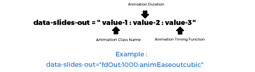
3 - Adding animation to hide a slide: Add "data-slides-out" attribute to the slide. It has 3 values separated by colon " : "
1st value of the attribute is animation class name.
2nd value of the attribute is animation duration.
3rd value of the attribute is animation timing function.
<!-- Slides Wrapper -->
class="carousel-inner"
<!-- Slide 1 -->
class="carousel-item active"
data-slides-in="fdInTp:2000:animEasein"
data-slides-out="fdOutBtm:500:animEaseinout"
src="your/image/url/01.png" alt="image 01" class="sz-bg-img"
<!-- All other elements will go here -->
Slide 1 data like image, text etc.
<!-- End of Slide 1 -->
<!-- Slide 2 -->
class="carousel-item"
data-slides-in="tltInTpRgt:3000:animLinear"
data-slides-out="boncOutTp:5000:animEaseinsine"
src="your/image/url/02.png" alt="image 02" class="sz-bg-img"
<!-- All other elements will go here -->
Slide 2 data like image, text etc.
<!-- End of Slide 2 -->
<!-- Slide 3 -->
class="carousel-item"
data-slides-in="folshIn:1200:animEaseoutquad"
data-slides-out="holeOut:1700:animSpeedy"
src="your/image/url/03.png" alt="image 03" class="sz-bg-img"
<!-- All other elements will go here -->
Slide 3 data like image, text etc.
<!-- End of Slide 3 -->
<!-- End of Slides Wrapper -->
For complete list of animation classes names please go to "Animating Elements" section and read the "Animation Effects Built-in Classes Names" part.
Slides Duration
Use data-duration attribute to increase or decrease transition duration of slides. You can assign a value in milliseconds only but without any unit. Default value is : 600
Slides Transition Duration
<!-- Assign value to data-duration attribute -->
id="mySliderId" class="carousel sz-slider" data-duration="300"
Slides Intervals
Use data-intervals attribute for slider cycle. Default value is : no
1 - If the value is no, slider will not automatically cycle.
<!-- Assign "no" value to data-intervals attribute -->
id="mySliderId" class="carousel sz-slider" data-intervals="no"
2 - i - If the value is yes, slider will automatically cycle. But you need further settings.
2 - ii - You must assign data-item-interval attribute to each slide separately. This attribute sets the amount of time to delay between automatically cycling an item.
2 - iii - data-item-interval attribute receive a numeric value without any unit, but it sets value in milliseconds.
<!-- Assign "yes" value to data-intervals attribute -->
id="mySliderId" class="carousel sz-slider" data-intervals="yes"
<!-- Slides Wrapper -->
class="carousel-inner"
<!-- Assign value to data-item-interval attribute -->
class="carousel-item active" data-item-interval="2000"Slide 1 data like image, text etc.
<!-- Assign value to data-item-interval attribute -->
class="carousel-item" data-item-interval="3000"Slide 2 data like image, text etc.
<!-- Assign value to data-item-interval attribute -->
class="carousel-item" data-item-interval="4000"Slide 3 data like image, text etc.
Slides Transition Timing Function
Use data-timing attribute for slides transition timing function. Default value is : ease
Slides Transition Timing Function
<!-- Assign value to data-timing attribute -->
id="mySliderId" class="carousel sz-slider" data-timing="easeinoutcubic"
Transition Timing Function Built-In List
| linear | ease | easein | easeout | easeinout |
| easeinsine | easeoutsine | easeinoutsine | easeinquad | easeoutquad |
| easeinoutquad | easeincubic | easeoutcubic | easeinoutcubic | easeinquart |
| easeoutquart | easeinoutquart | easeinquint | easeoutquint | easeinoutquint |
| easeinexpo | easeoutexpo | easeinoutexpo | easeincirc | easeoutcirc |
| easeinoutcirc | easeinback | easeoutback | easeinoutback | speedy |
| slowspeedy | easeoutincubic | swing |
Sticky Slider
Use data-sticky attribute to make slider sticky. Default value is : no
Only Works With Drag-able Animation
<!-- Assign value to data-sticky attribute -->
id="mySliderId" class="carousel sz-slider" data-sticky="yes"
Pause On Hover
Use data-pauses attribute to make slider pause on hover. Default value is : no
Slide cycle will stop on mouse over.
<!-- Assign value to data-pauses attribute -->
id="mySliderId" class="carousel sz-slider" data-pauses="yes"
Autoplay
Use data-start attribute to auto-play the carousel after the user manually cycles the 1st slide. Default value is : no
Slide cycle will start after user manually click navigations.
<!-- Assign value to data-start attribute -->
id="mySliderId" class="carousel sz-slider" data-start="yes"
Slides Cycle
Whether the carousel should cycle continuously or have hard stops at last slide. Use data-cycle attribute. Default value is : yes
Slide cycle will stop at the end.
<!-- Assign value to data-cycle attribute -->
id="mySliderId" class="carousel sz-slider" data-cycle="stop"
Mousewheel Control
Enables navigation through slides using mouse wheel. Use data-mouse attribute. Default value is : no
Navigate slides through mouse wheel.
<!-- Assign value to data-mouse attribute -->
id="mySliderId" class="carousel sz-slider" data-mouse="yes"
Keyboard Control
Enables navigation through slides using keyboard arrow keys. Default value is : no
In horizontal sliders left and right arrow keys work and in vertical sliders up and down arrow keys works. Use data-keyboards attribute.
<!-- Assign value to data-keyboards attribute -->
id="mySliderId" class="carousel sz-slider" data-keyboards="yes"
Pre-loaders
We have prepared some preloaders for slider. These preloaders will appears until whole window data like images not loaded completely. Default value is : circle
Use data-preloader attribute to attach a preloader. You can change background color and object color of preloader through this attribute.
<!--
data-preloader = " {value-1}:{value-2}:{value-3} "
data-preloader = " {type}:{object-color}:{background-color} "
types : circle (default) || dots || scale || box || bars "
-->
id="mySliderId" class="carousel sz-slider" data-preloader="circle:#1a73e8:#f8f9fa"
| circle | dots | scale | box | bars |
Cursors
You can change slider cursor with the help of data-cursor attribute. Default value is : default
Use data-cursor attribute.
<!-- Assign value to data-cursor attribute -->
id="mySliderId" class="carousel sz-slider" data-cursor="default-1"
| default | default-1 | move | grab | row-resize |
| col-resize | crosshair | e-resize | n-resize | pointer |
Links VS Drag
If you want to make links as slides or items then must assign "sz-links" class to them. This will prevent click during drag or swipe.
<!-- Slides Wrapper -->
class="carousel-inner"
<!-- Slide 1 -->
class="carousel-item active"
class="sz-links" href="your/link/path" target="_blank"
Slide 1 data like image, text etc.
<!-- Slide 2 -->
class="carousel-item"
class="sz-links" href="your/link/path" target="_blank"
Slide 2 data like image, text etc.
<!-- Slide 3 -->
class="carousel-item"
class="sz-links" href="your/link/path" target="_blank"
Slide 3 data like image, text etc.
Thumbnails / Indicators
If you want to create indicators or thumbnails then use the following HTML pattern.
For Indicators
<!-- Indicators -->
class="carousel-indicators"
<!-- Indicator 01 -->
data-target="#mySliderId" class="active"
<!-- Indicator 02 -->
data-target="#mySliderId"
<!-- Indicator 03 -->
data-target="#mySliderId"
For Thumbnails also use sz-thumbnails class and images inside the li elements.
<!-- Indicators -->
class="carousel-indicators sz-thumbnails"
<!-- Thumbnail 01 -->
data-target="#mySliderId" class="active"
src="your/image/url/01.png" alt="image 01"
<!-- Thumbnail 02 -->
data-target="#mySliderId"
src="your/image/url/02.png" alt="image 02"
<!-- Thumbnail 03 -->
data-target="#mySliderId"
src="your/image/url/03.png" alt="image 03"
Direction : Type : Position
You can change direction, type and Position of indicators or thumbnails by using the following way.
1 - First of all select the direction of indicators or thumbnails by using data-ind-direction attribute. Default value is : x
<!--
If you want to make horizontal indicators or thumbnails then assign "x" as value
If you want to make vertical indicators or thumbnails then assign "y" as value
-->
id="mySliderId" class="carousel sz-slider" data-ind-direction="x"
2 - Select the type of indicators or thumbnails by using data-ind-type attribute. Default value is : absolute
<!--
If you want to make separated indicators or thumbnails then assign "relative" as value
If you want to appear indicators or thumbnails on images then assign "absolute" as value
-->
id="mySliderId" class="carousel sz-slider" data-ind-direction="x" data-ind-type="absolute"
3 - At the end select the position of indicators or thumbnails by using data-ind-position attribute. Default value is : bottom
<!--
If you want to appear indicators or thumbnails top of the slider then assign "top" as value
If you want to appear indicators or thumbnails bottom of the slider then assign "bottom" as value
If you want to appear indicators or thumbnails left of the slider then assign "left" as value
If you want to appear indicators or thumbnails right of the slider then assign "right" as value
-->
id="mySliderId" class="carousel sz-slider" data-ind-direction="x" data-ind-type="absolute" data-ind-position="bottom"
How To Customize Or Create A New One?
You can customize or create new types of indicators or thumbnails for example.
1 - Changing the width, height, margin, padding etc. values of indicators or thumbnails wrapper according to your requirements.
<!-- You can use also other CSS properties -->
#mySliderId.carousel .carousel-indicators,
#mySliderId.carousel .carousel-indicators.sz-thumbnails
width: 100%;
height: 66px;
padding: 2px;
margin: 0 auto 5px auto;
2 - Changing the width, height, margin, padding etc. values of a single indicator or thumbnail according to your requirements.
<!-- You can use also other CSS properties -->
#mySliderId.carousel .carousel-indicators > li,
#mySliderId.carousel .carousel-indicators.sz-thumbnails > li
width: 150px;
height: auto;
padding: 0;
margin: 0 3px;
3 - Changing the active indicator or thumbnail CSS properties according to your requirements.
<!-- You can use also other CSS properties -->
#mySliderId.carousel .carousel-indicators > li.active,
#mySliderId.carousel .carousel-indicators.sz-thumbnails > li.active
border: 2px solid red;
opacity: 1;
How To Centralize The Indicators Or Thumbnails
If you want to centralize the indicators or thumbnails then fixed the width of their wrapper almost equal to their children.
For example in below example we are centralizing the thumbnails at slider's bottom and center.
<!-- Indicators -->
class="carousel-indicators sz-thumbnails" style="width:450px;margin:0 auto;"
<!-- Thumbnail 01 -->
data-target="#mySliderId" class="active" style="width:150px;margin:0;"
src="your/image/url/01.png" alt="image 01"
<!-- Thumbnail 02 -->
data-target="#mySliderId" style="width:150px;margin:0;"
src="your/image/url/02.png" alt="image 02"
<!-- Thumbnail 03 -->
data-target="#mySliderId" style="width:150px;margin:0;"
src="your/image/url/03.png" alt="image 03"
You can see in above example wrapper width (450) is equal to total width (150 x 3 = 450) of three thumbnails. If you are also using margin, padding or border then it must be included in wrapper width.
Transition Duration Of Thumbnails And Indicators Sliding
You can drag or swipe thumbnails or indicators. These are also move when we change a slide. You can change transition duration of thumbnails and indicators sliding by assigning "data-ind-duration" attribute to ( carousel-indicators ) div. Default value is : 200
It receive a numeric value without any unit and set in milliseconds.
<!-- Indicators -->
class="carousel-indicators" data-ind-duration="300"
<!-- Indicator 01 -->
data-target="#mySliderId" class="active"
<!-- Indicator 02 -->
data-target="#mySliderId"
<!-- Indicator 03 -->
data-target="#mySliderId"
Animating Elements
You can animate any element inside the carousel like images, text, buttons, icons, links etc. You can show or hide any element on-demand.
Slide will change after all animations completed related to that slide.
How To Create An Animated Element?
1 - First of all set "data-intervals" attribute value "yes" and as well as "data-start" attribute value "auto".
<!-- Assign "yes" value to "data-intervals" attribute -->
<!-- Assign "auto" value to "data-start" attribute -->
id="mySliderId" class="carousel sz-slider" data-intervals="yes" data-start="auto"
2 - If you are using "data-item-interval" attributes with slides or items then remove all these attributes or set their values to "false".
<!-- Remove the "data-item-interval" attributes Or assign them value "false" -->
class="carousel-inner"
class="carousel-item active" data-item-interval="false"Slide 1 data like image, text etc.
class="carousel-item" data-item-interval="false"Slide 2 data like image, text etc.
class="carousel-item" data-item-interval="false"Slide 3 data like image, text etc.
3 - Now add sz-animated class to that particular element you intend to animate in the carousel.
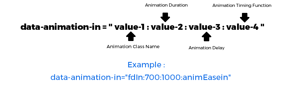
4 - Adding animation to show an element: Add "data-animation-in" attribute to the element. It has 4 values separated by colon " : "
1st value of the attribute is animation class name.
2nd value of the attribute is animation duration.
3rd value of the attribute is animation delay.
4th value of the attribute is animation timing function.
<!-- Slides Wrapper -->
class="carousel-inner"
<!-- Slide 1 -->
class="carousel-item active"
<!-- Background Image -->
src="your/image/url/01.png" alt="image 01"
<!-- Element start -->
class="sz-animated"
data-animation-in="fdInTp:2000:1000:animEasein"
Slide 1 Heading <!-- End of element -->
<!-- End of Slide 1 -->
<!-- Slide 2 -->
class="carousel-item"
<!-- Background Image -->
src="your/image/url/02.png" alt="image 02"
<!-- Element start -->
class="sz-animated"
data-animation-in="sclInXRgt:1000:500:animEaseincirc"
Slide 2 Heading <!-- End of element -->
<!-- End of Slide 2 -->
<!-- Slide 3 -->
class="carousel-item"
<!-- Background Image -->
src="your/image/url/03.png" alt="image 03"
<!-- Element start -->
class="sz-animated"
data-animation-in="fxInXpndF:1200:750:animEaseinexpo"
Slide 3 Heading <!-- End of element -->
<!-- End of Slide 3 -->
<!-- End of Slides Wrapper -->
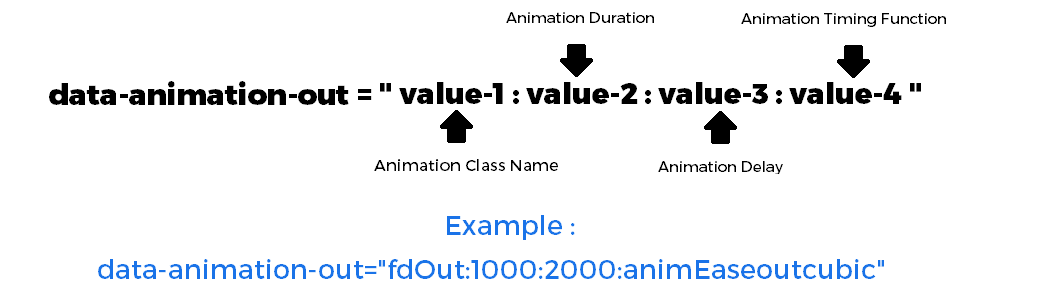
5 - Adding animation to hide an element: Add "data-animation-out" attribute to the element. It has 4 values separated by colon " : "
1st value of the attribute is animation class name.
2nd value of the attribute is animation duration.
3rd value of the attribute is animation delay.
4th value of the attribute is animation timing function.
<!-- Slides Wrapper -->
class="carousel-inner"
<!-- Slide 1 -->
class="carousel-item active"
<!-- Background Image -->
src="your/image/url/01.png" alt="image 01"
<!-- Element start -->
class="sz-animated"
data-animation-in="fdInTp:2000:1000:animEasein"
data-animation-out="rolOutRgt:1000:1500:animLinear"
Slide 1 Heading <!-- End of element -->
<!-- End of Slide 1 -->
<!-- Slide 2 -->
class="carousel-item"
<!-- Background Image -->
src="your/image/url/02.png" alt="image 02"
<!-- Element start -->
class="sz-animated"
data-animation-in="tltInTpRgt:1000:500:animEaseincirc"
data-animation-out="flpOutXTp:3000:2500:animEaseinout"
Slide 2 Heading <!-- End of element -->
<!-- End of Slide 2 -->
<!-- Slide 3 -->
class="carousel-item"
<!-- Background Image -->
src="your/image/url/03.png" alt="image 03"
<!-- Element start -->
class="sz-animated"
data-animation-in="rolInBlrTp:1200:750:animEaseinexpo"
data-animation-out="pufOutRgt:1000:5000:animEaseoutquint"
Slide 3 Heading <!-- End of element -->
<!-- End of Slide 3 -->
<!-- End of Slides Wrapper -->
Animation Effects Built-in Classes Names
- fdInTp inplay
- fdOutTp outplay
- fdInTr inplay
- fdOutTr outplay
- fdInRgt inplay
- fdOutRgt outplay
- fdInBr inplay
- fdOutBr outplay
- fdInBtm inplay
- fdOutBtm outplay
- fdInBl inplay
- fdOutBl outplay
- fdInLft inplay
- fdOutLft outplay
- fdInTl inplay
- fdOutTl outplay
- fdIn inplay
- fdOut outplay
- sldInTop inplay
- sldOutTp outplay
- sldInTr inplay
- sldOutTr outplay
- sldInRight inplay
- sldOutRgt outplay
- sldInBr inplay
- sldOutBr outplay
- sldInBottom inplay
- sldOutBtm outplay
- sldInBl inplay
- sldOutBl outplay
- sldInLeft inplay
- sldOutLft outplay
- sldInTl inplay
- sldOutTl outplay
- sldInElptTpF inplay
- sldOutElptTpF outplay
- sldInElptTpB inplay
- sldOutElptTpB outplay
- sldInElptRgtF inplay
- sldOutElptRgtF outplay
- sldInElptRgtB inplay
- sldOutElptRgtB outplay
- sldInElptBtmF inplay
- sldOutElptBtmF outplay
- sldInElptBtmB inplay
- sldOutElptBtmB outplay
- sldInElptLftF inplay
- sldOutElptLftF outplay
- sldInElptLftB inplay
- sldOutElptLftB outplay
- sclInCntr inplay
- sclOutCntr outplay
- sclInTp inplay
- sclOutTp outplay
- sclInTr inplay
- sclOutTr outplay
- sclInTl inplay
- sclOutTl outplay
- sclInRgt inplay
- sclOutRgt outplay
- sclInBr inplay
- sclOutBr outplay
- sclInBtm inplay
- sclOutBtm outplay
- sclInBl inplay
- sclOutBl outplay
- sclInLft inplay
- sclOutLft outplay
- sclInX inplay
- sclOutX outplay
- sclInXLft inplay
- sclOutXLft outplay
- sclInXRgt inplay
- sclOutXRgt outplay
- sclInY inplay
- sclOutY outplay
- sclInYTp inplay
- sclOutYTp outplay
- sclInYBtm inplay
- sclOutYBtm outplay
- rotSclUp noplay
- rotSclDwn noplay
- rotSclUpX noplay
- rotSclDwnX noplay
- rotSclUpY noplay
- rotSclDwnY noplay
- rotSclUpDgnlLft noplay
- rotSclDwnDgnlLft noplay
- rotSclUpDgnlRgt noplay
- rotSclDwnDgnlRgt noplay
- rotInCntr inplay
- rotOutCntr outplay
- rotInTp inplay
- rotOutTp outplay
- rotInTr inplay
- rotOutTr outplay
- rotInRgt inplay
- rotOutRgt outplay
- rotInBr inplay
- rotOutBr outplay
- rotInBtm inplay
- rotOutBtm outplay
- rotInBl inplay
- rotOutBl outplay
- rotInLft inplay
- rotOutLft outplay
- rotInTl inplay
- rotOutTl outplay
- rotInX inplay
- rotOutX outplay
- rotInY inplay
- rotOutY outplay
- rotInRgtDgnl inplay
- rotOutDgnlLft outplay
- rotInLftDgnl inplay
- rotOutDgnlRgt outplay
- rotInCw inplay
- rotOutCw outplay
- rotInCcw inplay
- rotOutCcw outplay
- rotInTrCw inplay
- rotOutTrCw outplay
- rotInTrCcw inplay
- rotOutTrCcw outplay
- rotInBrCw inplay
- rotOutBrCw outplay
- rotInBrCcw inplay
- rotOutBrCcw outplay
- rotInBlCw inplay
- rotOutBlCw outplay
- rotInBlCcw inplay
- rotOutBlCcw outplay
- rotInTlCw inplay
- rotOutTlCw outplay
- rotInTlCcw inplay
- rotOutTlCcw outplay
- rotCntr noplay
- rotTp noplay
- rotLft noplay
- rotYCntr noplay
- rotYLft noplay
- rotYRgt noplay
- rotTr noplay
- rotRgt noplay
- rotDgnlLft noplay
- rotXCntr noplay
- rotBr noplay
- rotXTp noplay
- rotBtm noplay
- rotXBtm noplay
- rotDgnlTr noplay
- rotDgnlRgt noplay
- rotDgnlTl noplay
- rotBl noplay
- rotDgnlBr noplay
- rotDgnlBl noplay
- rotTl noplay
- boncInTp inplay
- boncOutTp outplay
- boncInRgt inplay
- boncOutRgt outplay
- boncInBtm inplay
- boncOutBtm outplay
- boncInLft inplay
- boncOutLft outplay
- boncInFwd inplay
- boncInBck inplay
- boncOutBck outplay
- boncTp inplay
- boncBtm outplay
- boncLft inplay
- boncRgt outplay
- rolInLft inplay
- rolOutLft outplay
- rolInRgt inplay
- rolOutRgt outplay
- rolInTp inplay
- rolOutTp outplay
- rolInBtm inplay
- rolOutBtm outplay
- tltInTpLft inplay
- tltInTpRgt inplay
- tltInTr inplay
- tltInRgt inplay
- tltInRgts inplay
- tltInBr inplay
- tltInBtmLft inplay
- tltInBtmRgt inplay
- tltInBl inplay
- tltInLft inplay
- tltInLfts inplay
- tltInTl inplay
- flpInXBtm inplay
- flpOutXBtm outplay
- flpInXTp inplay
- flpOutXTp outplay
- flpInYRgt inplay
- flpOutYRgt outplay
- flpInYLft inplay
- flpOutYLft outplay
- flpInDgnlTr inplay
- flpOutDgnlTr outplay
- flpInDgnlBl inplay
- flpOutDgnlBl outplay
- flpInDgnlTl inplay
- flpOutDgnlTl outplay
- flpInDgnlBr inplay
- flpOutDgnlBr outplay
- sldInBlrTp inplay
- sldOutBlrTp outplay
- sldInBlrTr inplay
- sldOutBlrTr outplay
- sldInBlrRgt inplay
- sldOutBlrRgt outplay
- sldInBlrBr inplay
- sldOutBlrBr outplay
- sldInBlrBtm inplay
- sldOutBlrBtm outplay
- sldInBlrBl inplay
- sldOutBlrBl outplay
- sldInBlrLft inplay
- sldOutBlrLft outplay
- sldInBlrTl inplay
- sldOutBlrTl outplay
- rolInBlrLft inplay
- rolOutBlrLft outplay
- rolInBlrTp inplay
- rolOutBlrTp outplay
- rolInBlrRgt inplay
- rolOutBlrRgt outplay
- rolInBlrBtm inplay
- rolOutBlrBtm outplay
- txtFxIn inplay
- txtBlrOut outplay
- fxInCntrct inplay
- blrOutCntrct outplay
- fxInCntrctB inplay
- blrOutCntrctB outplay
- fxInXpnd inplay
- blrOutXpnd outplay
- fxInXpndF inplay
- blrOutXpndF outplay
- pufInCntr inplay
- pufOutCntr outplay
- pufInTp inplay
- pufOutTp outplay
- pufInTr inplay
- pufOutTr outplay
- pufInRgt inplay
- pufOutRgt outplay
- pufInBr inplay
- pufOutBr outplay
- pufInBtm inplay
- pufOutBtm outplay
- pufInBl inplay
- pufOutBl outplay
- pufInLft inplay
- pufOutLft outplay
- pufInTl inplay
- pufOutTl outplay
- pufInX inplay
- pufOutX outplay
- pufInY inplay
- pufOutY outplay
- sltInY inplay
- sltOutY outplay
- sltInX inplay
- sltOutX outplay
- sltInDgnlLft inplay
- sltOutDgnlLft outplay
- sltInDgnlRgt inplay
- sltOutDgnlRgt outplay
- trkInXpnd inplay
- trkOutXpnd outplay
- trkInCntrct inplay
- trkOutCntrct outplay
- swInF inplay
- swOutFwd outplay
- swInB inplay
- swOutBck outplay
- swInTpF inplay
- swOutTpF outplay
- swInTpB inplay
- swOutTpB outplay
- swInTrF inplay
- swOutTrF outplay
- swInTrB inplay
- swOutTrB outplay
- swInRgtF inplay
- swOutRgtF outplay
- swInRgtB inplay
- swOutRgtB outplay
- swInBrF inplay
- swOutBrF outplay
- swInBrB inplay
- swOutBrB outplay
- swInBtmF inplay
- swOutBtmF outplay
- swInBtmB inplay
- swOutBtmB outplay
- swInBlF inplay
- swOutBlF outplay
- swInBlB inplay
- swOutBlB outplay
- swInLftF inplay
- swOutLftF outplay
- swInLftB inplay
- swOutLftB outplay
- swInTlB inplay
- swOutTlB outplay
- swInTlF inplay
- vbrtSlo noplay
- vbrtFst noplay
- shkX noplay
- shkY noplay
- shkLr noplay
- shkTp noplay
- shkTr noplay
- shkRgt noplay
- shkBr noplay
- shkBtm noplay
- shkBl noplay
- shkLft noplay
- shkTl noplay
- jloX noplay
- jloY noplay
- jloDgnlLft noplay
- jloDgnlRgt noplay
- wblXBtm noplay
- wblXTp noplay
- wblYLft noplay
- wblYRgt noplay
- hrtBt noplay
- plsBck noplay
- ping noplay
- plsFwd noplay
- blnkSl noplay
- blnkFs noplay
- boInUp inplay
- boOutDwn outplay
- twstInDwn inplay
- twstInUp inplay
- folshIn inplay
- folshOut outplay
- holeOut outplay
- prspDwn outplay
- prspDwnR inplay
- prspLft outplay
- prspLftR inplay
- prspRgt outplay
- prspRgtR inplay
- prspUp outplay
- prspUpR inplay
- rotDwn outplay
- rotLf outplay
- rotRt outplay
- rotUp outplay
Animation Timing Function Built-In List
| animLinear | animEase | animEasein | animEaseout | animEaseinout |
| animEaseinsine | animEaseoutsine | animEaseinoutsine | animEaseinquad | animEaseoutquad |
| animEaseinoutquad | animEaseincubic | animEaseoutcubic | animEaseinoutcubic | animEaseinquart |
| animEaseoutquart | animEaseinoutquart | animEaseinquint | animEaseoutquint | animEaseinoutquint |
| animEaseinexpo | animEaseoutexpo | animEaseinoutexpo | animEaseincirc | animEaseoutcirc |
| animEaseinoutcirc | animEaseinback | animEaseoutback | animEaseinoutback | animSpeedy |
| animSlowspeedy | animEaseoutincubic | animSwing |
Some fantastic animation libraries list :
Multiple Items Or Slides Carousel
1 - First of all set "data-type" attribute value "carousel".
2 - Add "data-move" attribute to move slides. If you want to move one by one slides then assign value "1". But if you want to move all slides those are showing at once then assign value "all".
3 - You can also use data-free-mode="true" attribute to to make free-mode carousel.
<!-- Assign "carousel" value to "data-type" attribute -->
<!-- Assign "1" value to "data-move" attribute -->
<!-- Assign "true" value to "data-free-mode" attribute Or just remove it -->
id="mySliderId" class="carousel sz-slider" data-type="carousel" data-move="1"
@media (min-width:1201px)
- How many slides or items you want to show on screens with minimum width 1201px.
- Add "data-items" attribute. This attribute receive a numeric value. Default value is : "5"
- If you want to hide carousel on screens with minimum width 1201px then set "data-items" attribute value to "0".
<!--
1 - "data-items" will show 5 slides on screens with minimum width 1201px
-->
id="mySliderId" class="carousel sz-slider"
data-type="carousel"
data-move="1"
data-items="5"
@media (min-width:993px) and (max-width:1200px)
- How many slides or items you want to show on screens with minimum 993px and maximum 1200px width.
- Add "data-xlscreen" attribute. This attribute receive a numeric value. Default value is : "4"
- If you want to hide carousel on screens with minimum 993px and maximum 1200px width then set "data-xlscreen" attribute value to "0".
<!--
1 - "data-items" will show 5 slides on screens with minimum width 1201px
2 - "data-xlscreen" will show 4 slides on screens with minimum 993px and maximum 1200px width
-->
id="mySliderId" class="carousel sz-slider"
data-type="carousel"
data-move="1"
data-items="5"
data-xlscreen="4"
@media (min-width:769px) and (max-width:992px)
- How many slides or items you want to show on screens with minimum 769px and maximum 992px width.
- Add "data-lgscreen" attribute. This attribute receive a numeric value. Default value is : "3"
- If you want to hide carousel on screens with minimum 769px and maximum 992px width then set "data-lgscreen" attribute value to "0".
<!--
1 - "data-items" will show 5 slides on screens with minimum width 1201px
2 - "data-xlscreen" will show 4 slides on screens with minimum 993px and maximum 1200px width
3 - "data-lgscreen" will show 3 slides on screens with minimum 769px and maximum 992px width
-->
id="mySliderId" class="carousel sz-slider"
data-type="carousel"
data-move="1"
data-items="5"
data-xlscreen="4"
data-lgscreen="3"
@media (min-width:576px) and (max-width:768px)
- How many slides or items you want to show on screens with minimum 576px and maximum 768px width.
- Add "data-mdscreen" attribute. This attribute receive a numeric value. Default value is : "2"
- If you want to hide carousel on screens with minimum 576px and maximum 768px width then set "data-mdscreen" attribute value to "0".
<!--
1 - "data-items" will show 5 slides on screens with minimum width 1201px
2 - "data-xlscreen" will show 4 slides on screens with minimum 993px and maximum 1200px width
3 - "data-lgscreen" will show 3 slides on screens with minimum 769px and maximum 992px width
4 - "data-mdscreen" will show 2 slides on screens with minimum 576px and maximum 768px width
-->
id="mySliderId" class="carousel sz-slider"
data-type="carousel"
data-move="1"
data-items="5"
data-xlscreen="4"
data-lgscreen="3"
data-mdscreen="2"
@media (max-width:575px)
- How many slides or items you want to show on screens with maximum 575px width.
- Add "data-smscreen" attribute. This attribute receive a numeric value. Default value is : "1"
- If you want to hide carousel on screens with maximum 575px width then set "data-smscreen" attribute value to "0".
<!--
1 - "data-items" will show 5 slides on screens with minimum width 1201px
2 - "data-xlscreen" will show 4 slides on screens with minimum 993px and maximum 1200px width
3 - "data-lgscreen" will show 3 slides on screens with minimum 769px and maximum 992px width
4 - "data-mdscreen" will show 2 slides on screens with minimum 576px and maximum 768px width
5 - "data-smscreen" will show 1 slides on screens with maximum 575px width
-->
id="mySliderId" class="carousel sz-slider"
data-type="carousel"
data-move="1"
data-items="5"
data-xlscreen="4"
data-lgscreen="3"
data-mdscreen="2"
data-smscreen="1"
Videos Sliders And Carousels
HTML5 Video - Self-hosted : If you are using HTML5 video tag for self-hosted videos then use sz-video class to stop it on slide change.
<!-- Video -->
class="sz-video"
src="your/video/path/video.mp4" type="video/mp4"
AutoPlay : If you want to make auto-play videos then remember you must use playsinline, autoplay and muted attributes with all videos.
<!-- Video 1 -->
class="sz-video" playsinline muted autoplay
src="your/video/path/video-1.mp4" type="video/mp4"
<!-- Video 2 -->
class="sz-video" playsinline muted autoplay
src="your/video/path/video-2.mp4" type="video/mp4"
Play And Mute Buttons : If you want to show play or pause and muted and unmuted buttons then use the following HTML mark-up just after the video tags.
<!-- Video -->
class="sz-video" playsinline muted autoplay
src="your/video/path/video.mp4" type="video/mp4"
<!-- Play & Pause Button -->
type="button" class="sz-media-btn sz-pause-btn"
<!-- Mute & UnMute Button -->
type="button" class="sz-speaker-btn sz-mute-btnn"
YouTube, Vimeo Videos : If you are using iframe to embed YouTube or Vimeo videos then use sz-iframe class to stop it on slide change. Remember you can't drag or swipe an iframe video.
class="sz-iframe" src="https://www.youtube.com/embed/tb68MXVmVKs" frameborder="0" allow="accelerometer; autoplay; encrypted-media; gyroscope; picture-in-picture" allowfullscreen
Fraction Pagination
If you want to show active slide number and total length of slides then use the following HTML code. Add this code inside main slider div and after all others elements or just after navigation buttons.
<!-- If we need pagination -->
class="carousel-item-number"
<!-- Number Of Current Slide -->
class="carousel-item-single"
<!-- Divider -->
/
<!-- Total Numbers Of Slides -->
class="carousel-item-length"
Loading Bar
You can show loading bars for slides by using data-progress attribute.
Default value is : false
<!--
We are using "true" value into "data-progress" attribute
-->
id="mySliderId" class="carousel sz-slider" data-animation="dragX" data-progress="true" data-intervals="yes" data-start="auto"
When data-progress attribute value set to true then it append dynamically the following HTML code in each slide.
<!-- Slides Wrapper -->
class="carousel-inner"
<!-- Slide 1 -->
class="carousel-item active"
<!-- Background Image -->
src="your/image/url/01.png" alt="image 01" class="sz-bg-img"
<!-- Loading bar -->
class="sz-slide-bar-wrap"
<!-- Animated Part -->
class="sz-slide-bar"
<!-- End of loading bar -->
<!-- End of Slide 1 -->
<!-- Slide 2 -->
class="carousel-item"
<!-- Background Image -->
src="your/image/url/02.png" alt="image 02" class="sz-bg-img"
<!-- Loading bar -->
class="sz-slide-bar-wrap"
<!-- Animated Part -->
class="sz-slide-bar"
<!-- End of loading bar -->
<!-- End of Slide 2 -->
<!-- Slide 3 -->
class="carousel-item"
<!-- Background Image -->
src="your/image/url/03.png" alt="image 03" class="sz-bg-img"
<!-- Loading bar -->
class="sz-slide-bar-wrap"
<!-- Animated Part -->
class="sz-slide-bar"
<!-- End of loading bar -->
<!-- End of Slide 3 -->
<!-- End of Slides Wrapper -->
You can change CSS also.
<!-- For Loading Bar Wrapper -->
#mySliderId.carousel .sz-slide-bar-wrap
top: 0;
bottom: auto;
width: 100%;
height: 5px;
background: #717375;
<!-- For Animated Part -->
#mySliderId.carousel .sz-slide-bar-wrap > .sz-slide-bar
background: #1a73e8;
Loading Indicators
You can convert indicators into loading bars by using sz-ind-animated class with .carousel-indicators class, and span inside the li elements.
<!-- Use span inside li -->
class="carousel-indicators sz-ind-animated"
data-target="#mySliderId" class="active"
data-target="#mySliderId"
data-target="#mySliderId"
You can change CSS also.
#mySliderId.carousel > .carousel-indicators.sz-ind-animated > li > span
background: #1a73e8;
Parallax Background Effect
Use bg-parallax class to make background parallax effect and assign background image through CSS.
<!-- For Parallax Background Effect -->
id="mySliderId" class="carousel sz-slider bg-parallax" data-type="slider" style="background: #3b56ca url(your/image/path) top left/cover no-repeat;"
Scroll Down Button
If you want to show scroll down button then use the following HTML code. Add this code inside main slider div and after all others elements or just after navigation buttons.
<!-- If we need scroll down button -->
class="carousel-scroll-down"
<!-- All elements like text or icons will go here -->
Touch Functions
You can change the following touch functions by using their attributes and values:
| Attribute Name
data-* |
Default Value | Type | Description |
| fingers | 1 | int | If the requirements are not met, the swipe handler will not be able to trigger. You can determine the number of fingers to swipe. |
| threshold | 75 | int | You would have to determine the number of pixels for the swipe to trigger. For example if you have determined the pixels at 75 but the user moves its finger at 50 pixels the swipe will not function. |
| cancelThreshold | null | int | If the user wants to cancel the gesture, then it needs to swipe back the same pixels which has already been determined. |
| pinchThreshold | 20 | int | To consider a pinch, the number of pixels must be pinched by the finger. |
| maxTimeThreshold | null | int | For considering a swipe the touchEND and touchStart must not be exceeded and the time will be milliseconds. |
| fingerReleaseThreshold | 250 | int | If the two fingers are released one after another it will be considered as simultaneous release. |
| longTapThreshold | 500 | int | To release a long tap the time will be in milliseconds between the release and tap. |
| doubleTapThreshold | 200 | int | For a double tap the time of two taps will be set out in milliseconds. |
| triggerOnTouchEnd | true | boolean | When the user releases the finger it is considered as an event and it gets triggered with the touch. The touch event will automatically be cancelled after reaching the threshold after getting triggered. |
| triggerOnTouchLeave | true | boolean | If true, the swipe will end and trigger appropriate handlers. It will happen when the user leaves the swipe object. |
| allowPageScroll | auto | string |
How the page scroll is handled by the browser, when the user swipes an object, which is touchswipe.
"auto" : An object which is not defined as a swipe will make the page to scroll in any direction. "none" : It will not let the page to scroll, when the user swipes. "horizontal" : It will force the page to scroll horizontally. "vertical" : the page will scroll vertically to swipe. |
| fallbackToMouseEvents | true | boolean | If true, The mouse events will run on non touch devices, if it is considered false, the swipes will not be triggered by mouse events on the touch swipes. |
| preventDefaultEvents | true | boolean | The page doesn’t move if the default events are cancelled. You can customize it by disabling the native events fire and the handlers as well. |
| excludedElements | .noSwipe | string | The swipes do not trigger when the child element is specified by the jquery selector. It is excluded on default basis by using the class .noSwipe. |
<!-- You can change the following touch functions by using their attributes and values -->
id="mySliderId" class="carousel sz-slider"
data-fingers="1"
data-threshold="75"
data-cancelThreshold="null"
data-pinchThreshold="20"
data-maxTimeThreshold="null"
data-fingerReleaseThreshold="250"
data-longTapThreshold="500"
data-doubleTapThreshold="200"
data-triggerOnTouchEnd="true"
data-triggerOnTouchLeave="true"
data-allowPageScroll="auto"
data-fallbackToMouseEvents="true"
data-preventDefaultEvents="true"
data-excludedElements=".noSwipe"